I pick up and put down a lot of side projects, a lot of the time never to return to them again. I think normally it's down to the size and scope creep, or something in my life takes priority and I don't feel like going back to it after.
Something I've been interested in trying out is just doing very tiny but finished and complete pieces of work, I was thinking of calling these "sketches". They aren't big enough to big whole "project" but should only take 2 hours to 2 days maximum.
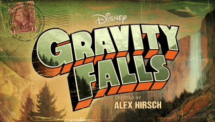
Anyway, I was re-watching Gravity Falls recently and thought it might be fun to try to re-create the logo with just CSS, it seemed like the perfect candidate to try out the new idea.
For reference the logo on the intro screen looks like this:

There's two hurdles I couldn't quite make it over, but if anyone has any ideas I'd love to hear them:
- I thought I could just skew the text or layer up multiple versions but the text has a kinda 3D extrusion effect going on. Without reaching for something like React-Three-Fiber I'm not 100% sure how I'd achieve that, so I played around with layering copies of the text.
- The warp effect is kinda possible with CSS but it's hard to arch the text. There's nothing for that as far as I'm aware.
Anyway here it is: